While GIS Maps are important to assure a distribution of needed services in more places other forms of visualization can work like traditional blueprints to help help build and sustain a broad network of age appropriate birth to work services in every poverty area on the GIS map.

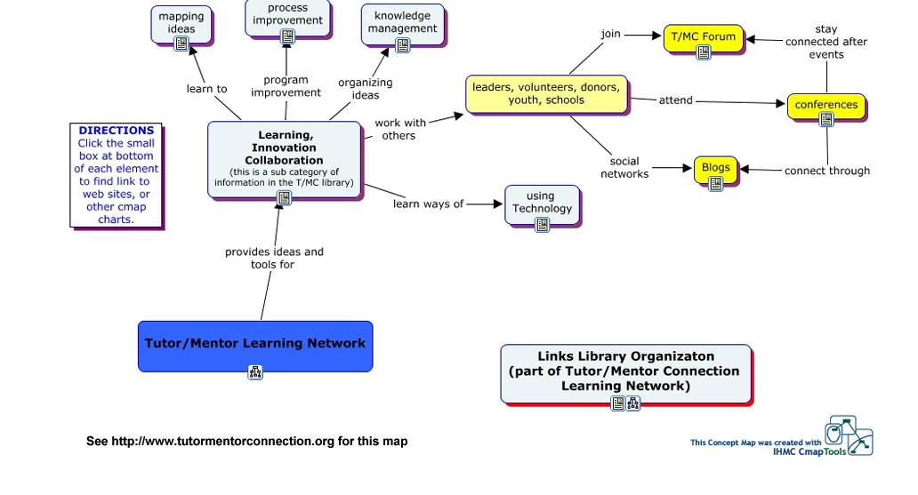
This graphic does double duty. It is a visual map of a section of the Tutor/Mentor Connection library which contains
ideas for mapping, visualization, collaboration and knowledge management.
The ideas in this section represent some of the most forward-thinking people in the world. If schools, communities, businesses and networks use these ideas to build their own organizational strengths the results can greatly enhance the work of any user-group.
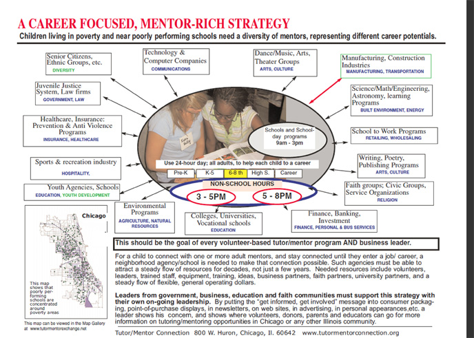
This second graphic is used to illustrate the goal of recruiting volunteers from many different industries to be part of many different tutor/mentor programs. It shows three times of the day for when programs can connect with youth. It shows a time line from birth to work where age-appropriate mentoring, learning and job exploration needs to be available. It includes a map to emphasize the need for such programs in

every poverty area. It also has two-way arrows illustrating that as volunteers learn from their mentoring and form bonds with youth and tutor/mentor organizations many will go back to their workplace, faith group, family and friends and encourage others to get involved.
In an environment where public funding is so difficult to find and sustain programs like this in 50 to 100 locations of Chicago, NYC, London or other big cities could actually spur the growth of private sector resources into these tutor/mentor programs as well as into other organizations needed in birth-to-work strategies.
This
section on the Tutor/Mentor Institute site includes a video that illustrates this potential growth of volunteer involvement to volunteer leadership.